A) spontaneous pie chart
B) perfect pie chart
C) exploded pie chart
D) exponential pie chart
Correct Answer

verified
Correct Answer
verified
Multiple Choice
You can use the 3-D Format options to add drop shadows,raised or beveled corners,and textured surfaces that give the illusion of ____ reflecting off the chart elements.
A) light
B) color
C) water
D) shadows
Correct Answer

verified
Correct Answer
verified
Short Answer
You can add ___________________ to identify smaller intervals between the major tick marks.
Correct Answer

verified
Correct Answer
verified
Multiple Choice
For which of the following reasons would you choose to use a chart or graph?
A) To organize information in columns and rows
B) To show trends or relationships across data
C) To present data using text only
D) To add color to a report
Correct Answer

verified
Correct Answer
verified
Multiple Choice
Critical-Thinking Case Based Questions Case 4-1 Andy has just started a job with the school district.His director has given him the last six months of test results from four local schools.Andy has organized the results as four data series and needs to display the trends in a graphic format. -Andy's boss wants him to compare the values in this chart with several different data sets.Andy should prepare a(n) ____ for his boss.
A) Radar chart
B) Line graph
C) Pie chart
D) XY scatter chart
Correct Answer

verified
Correct Answer
verified
Multiple Choice
Which of the following would result in adding the value 'k' to the end of each number on a chart's vertical axis?
A) #,##0"k"
B) k#,##
C) #,##0k
D) #,##0-k-
Correct Answer

verified
A
Correct Answer
verified
Multiple Choice
Which of the following shows the correct order of steps for adding a data series to a chart?
A) Select the chart,Click the Add button,Click the Select Data button,Select the range
B) Select the chart,Click the Select Data button,Click the Add button,Select the range
C) Select the range,Click the Select Data button,Click the Add button,Select the chart
D) Select the range,Select the chart,Click the Select Data button,Click the Add button
Correct Answer

verified
Correct Answer
verified
Multiple Choice
Anya has decided to make her chart a 3-D chart,but her supervisor complained that he cannot see enough of the data.Anya should try to ____.
A) raise the viewpoint of the chart by rotating along the y-axis
B) raise the viewpoint of the chart by rotating along the x-axis
C) spin the chart clockwise
D) replace the chart with a bar chart
Correct Answer

verified
Correct Answer
verified
Multiple Choice
Rotation options for a chart allow you to rotate the ____.
A) x-axis
B) y-axis
C) perspective
D) all of the above
Correct Answer

verified
Correct Answer
verified
Multiple Choice
With 3-D rotation,you can change a chart's ____.
A) rotation
B) perspective
C) depth
D) all of the above
Correct Answer

verified
D
Correct Answer
verified
Multiple Choice
Which of the following represents the pointer when it is over the resizing handle?
A) ![]()
B) ![]()
C) ![]()
D) ![]()
Correct Answer

verified
Correct Answer
verified
Multiple Choice
To specify the name of a new data series and its range of data values,use the ____ dialog box.
A) Edit Series
B) Select Data
C) Select Series
D) Add Data
Correct Answer

verified
Correct Answer
verified
True/False
When data bars are used with negative values,the date bars originate from the center of the cell with negative bars extending to the left and positive bars extending to the right.
Correct Answer

verified
Correct Answer
verified
Multiple Choice
The first step in creating a combination chart is to ____.
A) select a data series in an existing chart that you want to appear as another chart type
B) click Change Chart Type in the Chart Tools Design tab
C) select the chart type you want
D) open a new bland spreadsheet
Correct Answer

verified
Correct Answer
verified
Multiple Choice
='Trolley Schedule'!$A$2:$C$12 identifies a ____.
A) Series data range
B) Column chart type
C) Chart series source
D) Chart data range
Correct Answer

verified
Correct Answer
verified
Multiple Choice
Andy has experimented with a few different types of charts to give his boss options for reporting the test results.In his bar chart,Andy wants to change the chart's border.To do this,he should select the ____ tab in the Chart Tools.
A) Format
B) Edit
C) Design
D) Layout
Correct Answer

verified
Correct Answer
verified
Short Answer
A chart that combines two or more chart types into a single graph is called a(n)____________________ chart.
Correct Answer

verified
combination
Correct Answer
verified
Multiple Choice
MATCHING Identify the letter of the choice that best matches the phrase or definition. -Displays stock market data
A) Bubble
B) Column
C) XY
D) Line
E) Radar
F) Pie
G) Doughnut
H) Bar
I) Surface
J) Area
K) Stock
L) Scatter
Correct Answer

verified
Correct Answer
verified
Multiple Choice
To display Mar 17,2008 as a custom format,you would type ____ in the Format Code: box in Excel.
A) mm dd,yy
B) mmm dd,yy
C) mmm dd,yyyy
D) mm dd,yyyy
Correct Answer

verified
Correct Answer
verified
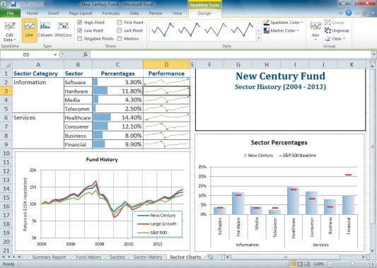
Multiple Choice
 -In the above figure,the data markers shown in the cells in the column labeled "Percentages," are ____.
A) data lines
B) sparklines
C) data bars
D) spark bars
Correct Answer

verified
Correct Answer
verified
Showing 1 - 20 of 150
Related Exams