Filters
Question type

Study Flashcards

In which type of population distribution would plot sampling be most accurate?


A) clumping
B) uniform
C) random
D) random and clumping
E) uniform and clumping

Correct Answer

verifed

verified

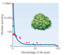
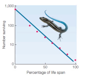
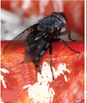
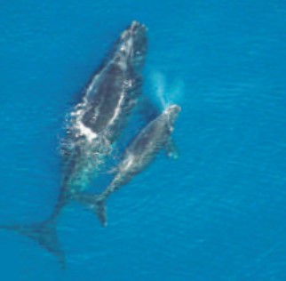
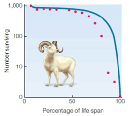
Match the following figures with the most appropriate statement. <table style="font-family: 'times new roman'; font-size: 11pt; color: #000000; font-weight: normal; left:2px; top:19px; width:744px; height:489px;" summary="An illustration shows 3 graphs and 2 photos. The graph A with an accompanying photo of the sheep shows the horizontal axis that represents the percentage of lifespan from 0 to 100 with increments of 50. The vertical axis represents the numbers surviving from 0 to 1000 with 10 and 100 in between. The curve starts from 1000 at vertical axis moves steadily and then falls down to 100%. Pink dots are shown along the lines of the curve. The graph B with an accompanying photo of a desert shrub shows the horizontal axis that represents the percentage of life span from 0 to 100 with increments of 50. The vertical axis represents the numbers surviving from 0 to 1 million with 100 and 10,000 in between. The curve starts from 1million and falls down along the vertical axis to 100 and moves steadily towards the horizontal axis. Pink dots are shown along the lines of the curve. The graph C with an accompanying photo of a lizard shows the horizontal axis represents the percentage of life span from 0 to 100 with increments of 50. The vertical axis represents the numbers surviving from 0 to 1000 with 10 and 100 in between. A straight line is seen across the graph that begins at 1000 and ends at 100. Pink dots are seen along the line. The photo D shows a black fly laying eggs on a tomato. The photo E shows two whales swimming in the water."> A. Match the following figures with the most appropriate statement.  <table style= font-family: 'times new roman'; font-size: 11pt; color: #000000; font-weight: normal; left:2px; top:19px; width:744px; height:489px;  summary= An illustration shows 3 graphs and 2 photos.  The graph A with an accompanying photo of the sheep shows the horizontal axis that represents the percentage of lifespan from 0 to 100 with increments of 50. The vertical axis represents the numbers surviving from 0 to 1000 with 10 and 100 in between. The curve starts from 1000 at vertical axis moves steadily and then falls down to 100%. Pink dots are shown along the lines of the curve.  The graph B with an accompanying photo of a desert shrub shows the horizontal axis that represents the percentage of life span from 0 to 100 with increments of 50. The vertical axis represents the numbers surviving from 0 to 1 million with 100 and 10,000 in between. The curve starts from 1million and falls down along the vertical axis to 100 and moves steadily towards the horizontal axis. Pink dots are shown along the lines of the curve.  The graph C with an accompanying photo of a lizard shows the horizontal axis represents the percentage of life span from 0 to 100 with increments of 50. The vertical axis represents the numbers surviving from 0 to 1000 with 10 and 100 in between. A straight line is seen across the graph that begins at 1000 and ends at 100. Pink dots are seen along the line.  The photo D shows a black fly laying eggs on a tomato.  The photo E shows two whales swimming in the water. > A.    B.    C.    D.    E.             B. Match the following figures with the most appropriate statement.  <table style= font-family: 'times new roman'; font-size: 11pt; color: #000000; font-weight: normal; left:2px; top:19px; width:744px; height:489px;  summary= An illustration shows 3 graphs and 2 photos.  The graph A with an accompanying photo of the sheep shows the horizontal axis that represents the percentage of lifespan from 0 to 100 with increments of 50. The vertical axis represents the numbers surviving from 0 to 1000 with 10 and 100 in between. The curve starts from 1000 at vertical axis moves steadily and then falls down to 100%. Pink dots are shown along the lines of the curve.  The graph B with an accompanying photo of a desert shrub shows the horizontal axis that represents the percentage of life span from 0 to 100 with increments of 50. The vertical axis represents the numbers surviving from 0 to 1 million with 100 and 10,000 in between. The curve starts from 1million and falls down along the vertical axis to 100 and moves steadily towards the horizontal axis. Pink dots are shown along the lines of the curve.  The graph C with an accompanying photo of a lizard shows the horizontal axis represents the percentage of life span from 0 to 100 with increments of 50. The vertical axis represents the numbers surviving from 0 to 1000 with 10 and 100 in between. A straight line is seen across the graph that begins at 1000 and ends at 100. Pink dots are seen along the line.  The photo D shows a black fly laying eggs on a tomato.  The photo E shows two whales swimming in the water. > A.    B.    C.    D.    E.             C. Match the following figures with the most appropriate statement.  <table style= font-family: 'times new roman'; font-size: 11pt; color: #000000; font-weight: normal; left:2px; top:19px; width:744px; height:489px;  summary= An illustration shows 3 graphs and 2 photos.  The graph A with an accompanying photo of the sheep shows the horizontal axis that represents the percentage of lifespan from 0 to 100 with increments of 50. The vertical axis represents the numbers surviving from 0 to 1000 with 10 and 100 in between. The curve starts from 1000 at vertical axis moves steadily and then falls down to 100%. Pink dots are shown along the lines of the curve.  The graph B with an accompanying photo of a desert shrub shows the horizontal axis that represents the percentage of life span from 0 to 100 with increments of 50. The vertical axis represents the numbers surviving from 0 to 1 million with 100 and 10,000 in between. The curve starts from 1million and falls down along the vertical axis to 100 and moves steadily towards the horizontal axis. Pink dots are shown along the lines of the curve.  The graph C with an accompanying photo of a lizard shows the horizontal axis represents the percentage of life span from 0 to 100 with increments of 50. The vertical axis represents the numbers surviving from 0 to 1000 with 10 and 100 in between. A straight line is seen across the graph that begins at 1000 and ends at 100. Pink dots are seen along the line.  The photo D shows a black fly laying eggs on a tomato.  The photo E shows two whales swimming in the water. > A.    B.    C.    D.    E.             D. Match the following figures with the most appropriate statement.  <table style= font-family: 'times new roman'; font-size: 11pt; color: #000000; font-weight: normal; left:2px; top:19px; width:744px; height:489px;  summary= An illustration shows 3 graphs and 2 photos.  The graph A with an accompanying photo of the sheep shows the horizontal axis that represents the percentage of lifespan from 0 to 100 with increments of 50. The vertical axis represents the numbers surviving from 0 to 1000 with 10 and 100 in between. The curve starts from 1000 at vertical axis moves steadily and then falls down to 100%. Pink dots are shown along the lines of the curve.  The graph B with an accompanying photo of a desert shrub shows the horizontal axis that represents the percentage of life span from 0 to 100 with increments of 50. The vertical axis represents the numbers surviving from 0 to 1 million with 100 and 10,000 in between. The curve starts from 1million and falls down along the vertical axis to 100 and moves steadily towards the horizontal axis. Pink dots are shown along the lines of the curve.  The graph C with an accompanying photo of a lizard shows the horizontal axis represents the percentage of life span from 0 to 100 with increments of 50. The vertical axis represents the numbers surviving from 0 to 1000 with 10 and 100 in between. A straight line is seen across the graph that begins at 1000 and ends at 100. Pink dots are seen along the line.  The photo D shows a black fly laying eggs on a tomato.  The photo E shows two whales swimming in the water. > A.    B.    C.    D.    E.             E. Match the following figures with the most appropriate statement.  <table style= font-family: 'times new roman'; font-size: 11pt; color: #000000; font-weight: normal; left:2px; top:19px; width:744px; height:489px;  summary= An illustration shows 3 graphs and 2 photos.  The graph A with an accompanying photo of the sheep shows the horizontal axis that represents the percentage of lifespan from 0 to 100 with increments of 50. The vertical axis represents the numbers surviving from 0 to 1000 with 10 and 100 in between. The curve starts from 1000 at vertical axis moves steadily and then falls down to 100%. Pink dots are shown along the lines of the curve.  The graph B with an accompanying photo of a desert shrub shows the horizontal axis that represents the percentage of life span from 0 to 100 with increments of 50. The vertical axis represents the numbers surviving from 0 to 1 million with 100 and 10,000 in between. The curve starts from 1million and falls down along the vertical axis to 100 and moves steadily towards the horizontal axis. Pink dots are shown along the lines of the curve.  The graph C with an accompanying photo of a lizard shows the horizontal axis represents the percentage of life span from 0 to 100 with increments of 50. The vertical axis represents the numbers surviving from 0 to 1000 with 10 and 100 in between. A straight line is seen across the graph that begins at 1000 and ends at 100. Pink dots are seen along the line.  The photo D shows a black fly laying eggs on a tomato.  The photo E shows two whales swimming in the water. > A.    B.    C.    D.    E.
Premises
opportunistic life history
Responses
A
C
D
E
B

Correct Answer

A
C
D
E
B

Which is a density-independent factor?


A) competition
B) predation
C) earthquakes
D) parasitism
E) disease

Correct Answer

verifed

verified

An epidemic facilitated by a high, dense population is an example of a(n) ____ factor.


A) density-dependent
B) density-independent
C) biotic
D) logistic
E) exponential

Correct Answer

verifed

verified

Typically, members of a cohort are tracked ____.


A) until they become independent
B) until their breeding age
C) for a period of time and then released in the environment to serve their purpose in the community
D) from birth to death
E) as long as they are in good health and serve the purpose of a study

Correct Answer

verifed

verified

A flood that washes away an entire population of rabbits is a(n) ____.


A) density-dependent factor
B) intrinsic limiting factor
C) density-independent factor
D) consequence of exponential growth
E) example of a population reaching its carrying capacity

Correct Answer

verifed

verified

Match the following terms with the most appropriate statement.

Premises
the study of interactions among organisms, and between organisms and their environment
Responses
population size
sample
demographics
per capita growth rate
exponential
population density
population distribution
mark-recapture
ecology

Correct Answer

population size
sample
demographics
per capita growth rate
exponential
population density
population distribution
mark-recapture
ecology

Match the terms with the most appropriate statement.

Premises
long life spans, few offspring, extended care of young
Responses
density-independent factor
r-selected species
demographic transitional stage
type I survivorship
logistic growth
biotic potential
density-dependent factor

Correct Answer

density-independent factor
r-selected species
demographic transitional stage
type I survivorship
logistic growth
biotic potential
density-dependent factor

Which group describes a population?


A) members of a population are all genetically identical
B) members of a population live together and interbreed
C) a population may include both predators and prey
D) members of a population spend much of their time living apart
E) members of a population can live in two geographic areas

Correct Answer

verifed

verified

Density-independent controls over population growth include ____.


A) parasites
B) temperature
C) disease
D) competition
E) predation

Correct Answer

verifed

verified

What is the major assumption of the exponential model of population growth?


A) resources are unlimited
B) organisms selectively choose their mates
C) the death rate equals the birth rate
D) biotic potential is limited
E) density-dependent factors are at work

Correct Answer

verifed

verified

Match the terms with the most appropriate statement.

Premises
a harsh winter is an example of this
Responses
demographic transitional stage
biotic potential
logistic growth
density-dependent factor
type I survivorship
r-selected species
density-independent factor

Correct Answer

demographic transitional stage
biotic potential
logistic growth
density-dependent factor
type I survivorship
r-selected species
density-independent factor

India is in which demographic transitional stage?


A) birth and death rates equally high; growth rate low
B) death rate dropping fast; birth rate declining but slowly
C) birth rates declining and approaching the death rates
D) birth rate falling below death rate; population size decreasing
E) death rate greatly exceeds birth rate; population is close to extinction

Correct Answer

verifed

verified

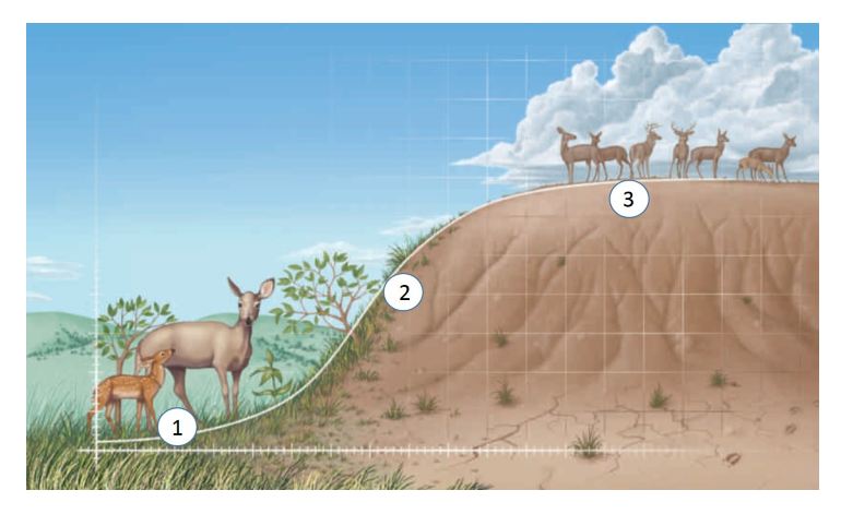
    During phase  2  in the figure above, the growth is ____ as long as resources are plentiful. A) logical B) logistical C) arithmetic D) exponential E) analytical   During phase "2" in the figure above, the growth is ____ as long as resources are plentiful.


A) logical
B) logistical
C) arithmetic
D) exponential
E) analytical

Correct Answer

verifed

verified

A group of organisms of the same species that live in a specific location is called a(n) ____.


A) community
B) population
C) species
D) genus
E) biome

Correct Answer

verifed

verified

A population ecologist wants to estimate the size of a robin population. In an apple orchard, she captures 10 robins, marks them, and then releases them. She returns several weeks later and captures another 10 robins, of which 2 are robins she previously marked. The estimated population size of robins is ____.


A) ​50
B) ​15
C) ​10
D) ​200
E) ​20

Correct Answer

verifed

verified

    During phase  1  in the figure above, the size of the deer population grows slowly because ____. A) predators eat fawns as they are born B) the number of breeding individuals is small C) the temperatures are relatively extreme D) the amount of food available is relatively scarce E) fawns are subject to disease   During phase "1" in the figure above, the size of the deer population grows slowly because ____.


A) predators eat fawns as they are born
B) the number of breeding individuals is small
C) the temperatures are relatively extreme
D) the amount of food available is relatively scarce
E) fawns are subject to disease

Correct Answer

verifed

verified

It has been estimated that if everyone in the world had the same lifestyle as the average American, it would require ____ more Earths.


A) one
B) ​two
C) ​three
D) ​four
E) ​five

Correct Answer

verifed

verified

Refer to the following figure for questions 53, 54, and 55. Refer to the following figure for questions 53, 54, and 55.       Letter  B  designates the ____, which allowed for an increase in human population growth. A) Bubonic plague B) domestication of plants and animals C) industrial and scientific revolutions D) discovery of America E) emergence of agriculturally based urban societies Refer to the following figure for questions 53, 54, and 55.       Letter  B  designates the ____, which allowed for an increase in human population growth. A) Bubonic plague B) domestication of plants and animals C) industrial and scientific revolutions D) discovery of America E) emergence of agriculturally based urban societies   Letter "B" designates the ____, which allowed for an increase in human population growth.
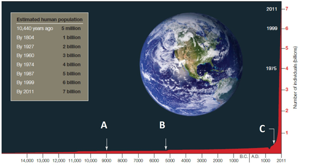

A) Bubonic plague
B) domestication of plants and animals
C) industrial and scientific revolutions
D) discovery of America
E) emergence of agriculturally based urban societies

Correct Answer

verifed

verified

In a population of Asian elephants, the death rate equals the birth rate. This population ____.


A) has reached its biotic potential
B) is not growing
C) has not exceeded its carrying capacity
D) is experiencing exponential growth
E) is experiencing survivorship growth

Correct Answer

verifed

verified

Showing 21 - 40 of 100

Related Exams

Show Answer